What You Should Know About PowerPoint Graph Animation

Introduction: Why Animate Your PowerPoint Graphs?
Welcome to the world of dynamic presentations! In this blog, we’ll dive deep into the exciting realm of PowerPoint Graph Animation. Whether you’re a seasoned presenter or a novice looking to spruce up your slides, mastering graph animation can transform your presentations from mundane to mesmerizing. Let’s embark on this journey to make your data dance!
Before You Animate: Understanding Your Data
Embarking on the journey of animating graphs in PowerPoint, it’s pivotal to lay the groundwork first. This means developing a deep understanding of your data. Why? Because the best animations stem from a clear grasp of what the data is and what story it aims to tell. Let’s break down the essentials of comprehending your data before adding that creative flair.
The Heart of Data: What Are You Really Looking at?
Data is not just numbers and charts, it’s like a story waiting to be exposed. Begin by asking yourself some critical questions:
- What’s the Origin? Know where your data comes from. Is it market research, a scientific study, or annual sales figures?
- What’s the Purpose? Determine what you’re trying to convey. Are you showcasing trends, comparing groups, or tracking growth over time?
- Who’s the Audience? Understand who will view this data. Are they industry experts, students, or potential investors?
Interpreting Data: Beyond the Surface
Once you’ve outlined the basics, dive deeper:
- Trends and Patterns: Look for trends or patterns. Is there a consistent rise, a notable dip, or a periodic cycle?
- Outliers and Anomalies: Identify any data points that stand out. These can often be the most interesting parts of your story.
- Comparisons and Contrasts: Consider what you are comparing. How do different segments or time periods stack up against each other?
Choosing the Right Graph
Your understanding of the data will guide you in selecting the most effective graph type. Here’s a quick guide by Whimsitoons:
- Line Graphs: Perfect for displaying trends over time.
- Bar Charts: Great for comparing quantities among different groups.
- Pie Charts: Best for displaying proportions of a whole.
- Data Integrity: The Ethical Angle
Maintaining the integrity of your data is non-negotiable. Avoid manipulating or cherry-picking data to fit a narrative. Your audience trusts you to present information truthfully.
Preparing Data for Animation
Finally, prepare your data:
- Simplify Complex Data: Break down complex data into simpler, more digestible parts.
- Sequence Your Information: Decide the order in which you’ll present data points. This will shape your animation’s flow.
- Highlight Key Points: Identify which elements of your data deserve emphasis and plan your animations around them.
The Magic of Animation: Bringing Data to Life
Animate Graph PowerPoint: It’s not just about making elements move; it’s about telling a story. Here’s why you should consider animating your graphs:
- Engagement: Animated graphs capture attention and keep your audience hooked.
- Understanding: Complex data becomes digestible through well-thought-out animations.
- Memorability: People remember what they see in motion better than static images.
Getting Started with PowerPoint Graph Animation
Before diving into the how-to, ensure you have a clear idea of what you want to achieve with your animation. Is it to highlight a growth trend? Show changes over time? Whatever it is, your animation should have a purpose.
Step-by-Step Guide:
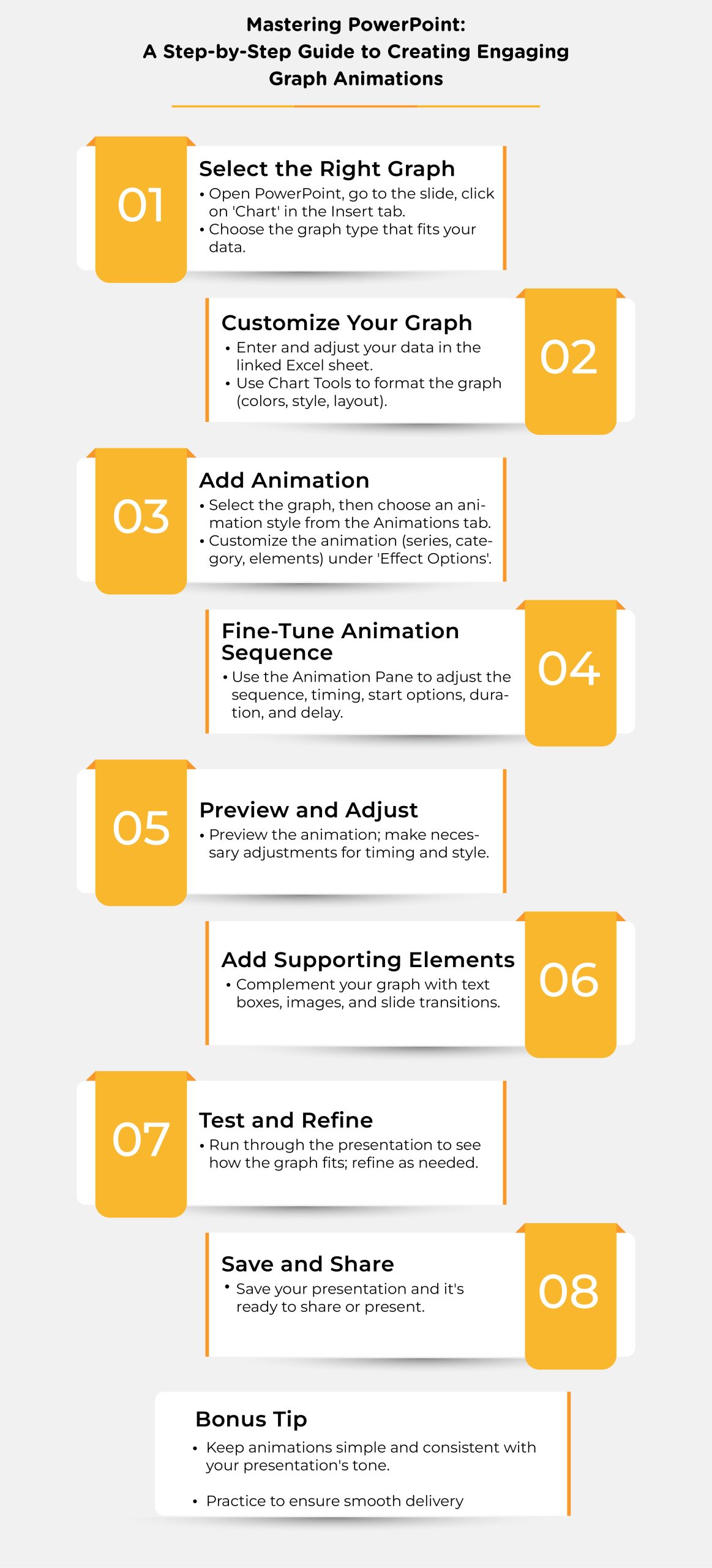
- Select Your Graph: Insert a graph in PowerPoint. You can choose from bar, line, pie, etc.
- Access Animation Options: Click on your graph and navigate to the ‘Animations’ tab.
- Choose Your Animation: Select an animation style. Start with simple ones like ‘Appear’ or ‘Fade’.

Creative PowerPoint Graphs: Beyond Basics
Once you’ve got the hang of basic animations, it’s time to level up!
Advanced Techniques:
- Custom Animation Paths: Make elements move along a specific trajectory.
- Timing Adjustments: Control the speed and sequence of your animations.
- Combining Animations: Use multiple animations on one graph for added effect.
Design Principles for Animated Graphs
When it comes to animating graphs in PowerPoint, the design is just as crucial as the data itself. A well-designed animated graph not only communicates your message effectively but also engages and retains your audience’s attention. To understand it better check out the table given below:
| Design Principle | Key Focus | Implementation Strategy |
| Clarity and Simplicity | Ensure the graph is easy to understand and interpret. | Use essential elements, prioritize readability with clear fonts and colors. |
| Consistency | Create a cohesive and professional look. | Maintain a uniform style and consistent animation types throughout the presentation. |
| Color Theory | Utilize colors to convey meaning and emphasize data. | Use contrasting colors for differentiation and specific colors to highlight important data. |
| Balance and Composition | Achieve an aesthetically pleasing and understandable graph. | Employ symmetry and visual hierarchy to guide the viewer’s attention effectively. |
| Movement and Emphasis | Enhance understanding and focus through animation. | Use purposeful and subtle animations to highlight and illustrate data points. |
| Audience-Centric Design | Tailor the graph to the audience’s understanding and interest. | Design for the audience’s familiarity, focusing on engagement and relevance over spectacle. |
Balancing Act: Professional Yet Captivating
It’s crucial to strike the right balance. Your animations should enhance your presentation, not distract from it.
Tips for Professional Animations:
- Subtlety is Key: Avoid overly flashy animations.
- Consistency: Use similar animation styles throughout your presentation.
- Rehearse: Test your animations to ensure they work as intended.
Storytelling with Animated Graphs
Remember, each animated graph should contribute to the narrative of your presentation.
- Build Suspense: Reveal data points one by one to keep the audience engaged.
- Highlight Key Points: Use emphasis animations to draw attention to crucial data.
PowerPoint Graph Animation: Case Studies
Let’s look at some scenarios where animated graphs made a significant impact.
- Marketing Pitch: A start-up used animated graphs to showcase growth potential.
- Educational Lecture: A teacher animated historical data to show trends over time.
Table of Comparison: Static vs. Animated Graphs
| Feature | Static Graphs | Animated Graphs |
| Engagement Level | Moderate | High |
| Clarity in Presentation | Good | Excellent |
| Audience Memorability | Less | More |
| Ability to Tell Story | Limited | Extensive |
| Customization | Basic | High |
Additional PowerPoint Animation Features
- Animation Pane: Manage and customize animations.
- Preview Function: See animations in action before presenting.
- Advanced Timeline: Control the timing and sequence.
Animated Graph Presentation: Dos and Don’ts
Do:
- Use animations to highlight important data.
- Keep animations consistent with the theme.
- Use colors and fonts that are easy to read.
Don’t:
- Overuse animations.
- Complicate simple data with excessive animation.
- Ignore the audience’s perspective.
Animation Software Alternatives to PowerPoint
For animated graph presentations, stepping outside of PowerPoint can open up an array of possibilities in terms of functionality and creativity. The following is a short table that highlights some notable software options, each with special capabilities and advantages for your animated presentations:
| Software | Key Features | Ideal For |
| Adobe After Effects | Professional-grade animation capabilities for intricate designs. | Video editing and animation professionals needing advanced features. |
| Google Slides | Cloud-based, collaborative platform with user-friendly animation options. | Teams collaborating in real-time, valuing accessibility over advanced animations. |
| Prezi | Non-linear presentations with a zoomable canvas for dynamic storytelling. | Presenters aiming for interactive, engaging presentations beyond traditional slides. |
| Keynote | Sleek templates and customizable animations, optimized for Apple devices. | Apple users seeking an intuitive and aesthetically pleasing presentation experience. |
| Canva | Easy-to-use design tool with stylish templates for quick, appealing presentations. | Non-designers and those needing to quickly create visually striking presentations. |
- Overwhelming Data: Simplify by breaking down into multiple animated graphs.
- Technical Glitches: Always have a backup plan, like a static version.
Wrapping Up: The Art of Animated Graphs in PowerPoint
PowerPoint Graph Animation is an art that balances creativity and professionalism. It’s not just about making data more engaging; it’s about crafting a story that resonates with your audience. Experiment, practice, and remember, the best presentations are those where the data doesn’t just speak; it dances.
FAQs
Q 1: Can I animate all types of graphs in PowerPoint?
Yes, but the effectiveness varies depending on the graph type.
Q 2: How long should my animation be?
Keep it short and sweet. Typically, a few seconds per animation work well.
Q 3: Can animations be combined with other PowerPoint features?
Absolutely! Pair them with transitions, sound effects, etc., for a richer experience.
Q 4: Are animated graphs suitable for all audiences?
Tailor your animation complexity to your audience's familiarity with the subject.
Q 5: Can I export my animated graphs?
Yes, you can save your presentation as a video or GIF.


